
Amikal is a multi-script typeface with an amicable atmosphere inspired by primary italics from the Renaissance. Drawing on this rich heritage, the typeface comes with a modern look satisfying your sense of current typeface design.
The charismatic appearance makes Amikal the ideal choice for continuous reading requiring a friendly and unique character. Reading a text set in Amikal is like listening to a story told to you with a warm and agreeable voice while sharing a comfortable chair with a purring cat on your lap in front of the fire place.

A reorganized alignment
One of the two main characteristics of Amikal is the emphasis on the x-height [1]. It aligns the letter shapes where they contain the main design information. Additionally, the stress on the x-height ensures generous counters, which guarantee high legibility even in small size.
A shaping influence
The second main feature is the italic heritage from the Renaissance giving the typeface its unique character. It is noticeable in the swollen ascender terminals [2], the gentle slant [3] of letter shapes and the fluid ductus in general.
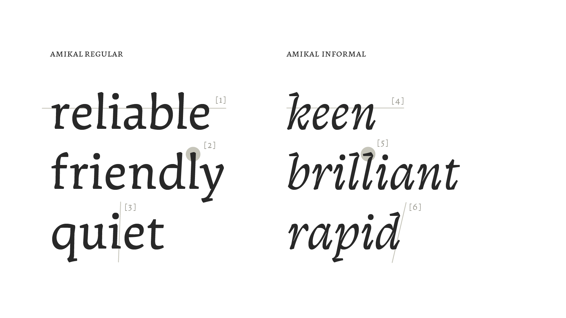
A compatible sibling
Regular and informal Amikal have different roots. This gives the secondary style the freedom to maintain a lot of its origin personality. Nevertheless, the association with its regular counterpart is undisputed and the informal style is art-fully connected with it. The highlighted x-height also [4] takes the visual lead. Strong horizontal features [5], like the serifs on the ascenders, complete the coherence within the typeface while the steep angle [6], together with the fast ductus ensure enough differentiation.
Regular and informal Amikal have different roots. This gives the secondary style the freedom to maintain a lot of its origin personality. Nevertheless, the association with its regular counterpart is undisputed and the informal style is art-fully connected with it. The highlighted x-height also [4] takes the visual lead. Strong horizontal features [5], like the serifs on the ascenders, complete the coherence within the typeface while the steep angle [6], together with the fast ductus ensure enough differentiation.


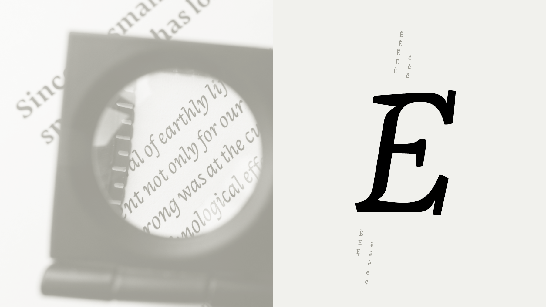
Distinct siblings
Greek regular is closely related to the Latin equivalent. However, the peculiarities of the Greek script got a lot of attention and are well preserved. This is mainly visible in the round ductus, the various axes for single characters [1] and the careful treatment of in strokes and out strokes [2]. To achieve coherence in the family, Greek regular has a stress on its base character height [3]. Overall, it is the amicable appearance that unifies Latin and Greek regular.
Greek regular is closely related to the Latin equivalent. However, the peculiarities of the Greek script got a lot of attention and are well preserved. This is mainly visible in the round ductus, the various axes for single characters [1] and the careful treatment of in strokes and out strokes [2]. To achieve coherence in the family, Greek regular has a stress on its base character height [3]. Overall, it is the amicable appearance that unifies Latin and Greek regular.
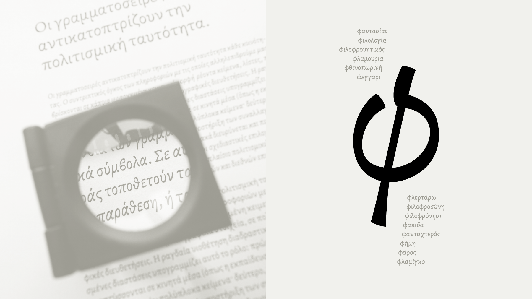
Highlighting in expressive ways
Greek informal is a very expressive style and ideally suited to emphasize parts in a text set in Greek regular.
The steep angle [4] supports the dynamic appearance together with the tempering in the stems [5]. The resulting style is really energetic, just like its Latin equivalent.
Greek informal is a very expressive style and ideally suited to emphasize parts in a text set in Greek regular.
The steep angle [4] supports the dynamic appearance together with the tempering in the stems [5]. The resulting style is really energetic, just like its Latin equivalent.

Exploring other writing systems
Amikal Sinhala is the consequent transfer of an idea to a completely different writing system. Cultural values were given priority in the design process. However, Amikal Sinhala still introduces innovative solutions to current Sinhala styles.
Amikal Sinhala is the consequent transfer of an idea to a completely different writing system. Cultural values were given priority in the design process. However, Amikal Sinhala still introduces innovative solutions to current Sinhala styles.
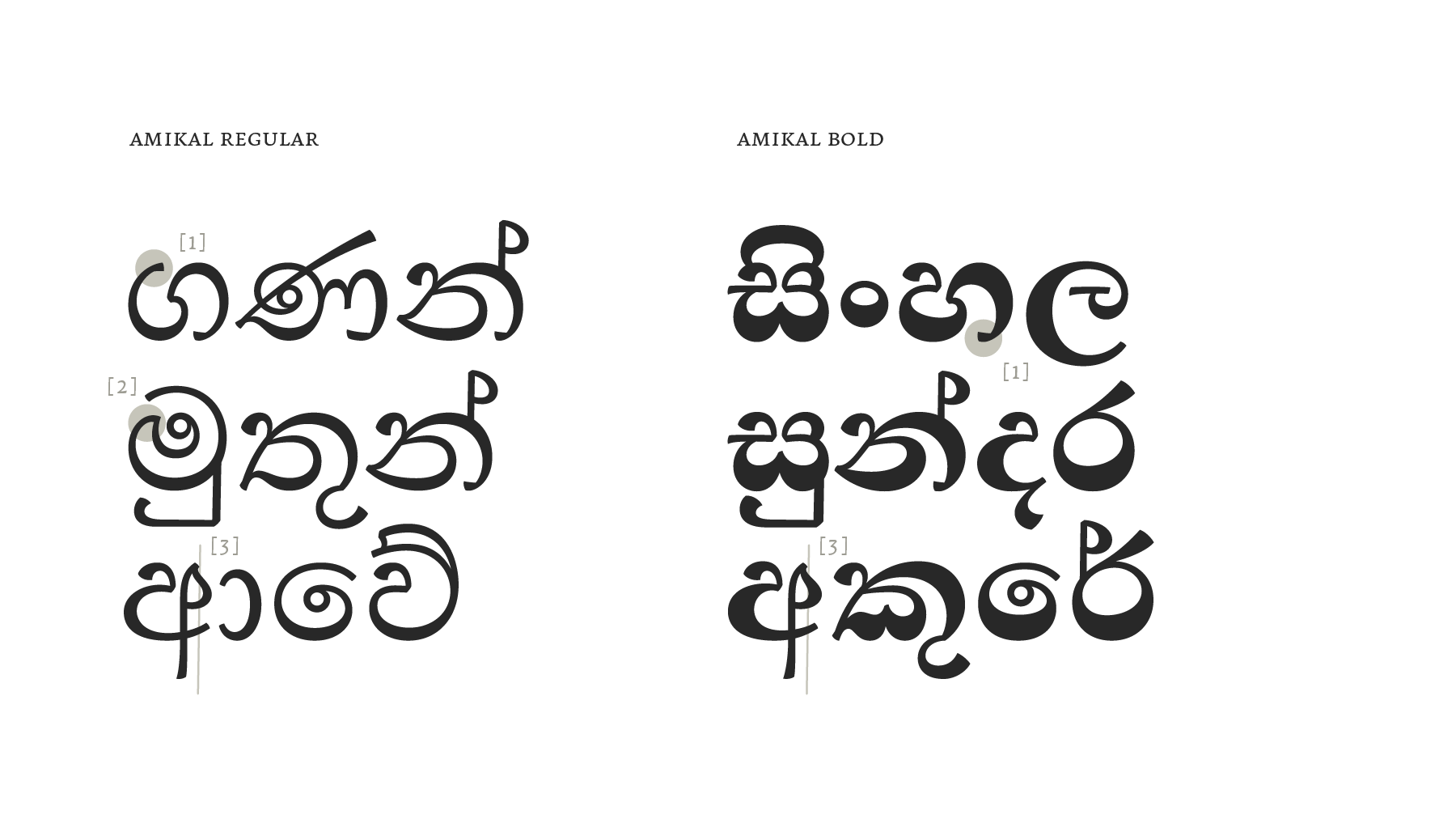
Distinctive features
In strokes and out strokes are treated in an Amikal-like manner [1].The slight angle in vertical stems is maintained [2]. A corner [3] inspired by handwriting helps balancing the shapes and is coincidentally a characteristic feature.
In strokes and out strokes are treated in an Amikal-like manner [1].The slight angle in vertical stems is maintained [2]. A corner [3] inspired by handwriting helps balancing the shapes and is coincidentally a characteristic feature.

